
Color Contrast Checker
Compute contrast ratio and WCAG pass/fail for normal and large text.
Introduction:
Can only 8% of your website visitors actually read your content? For people with low vision or color blindness, poor color contrast doesn’t just make things harder—it can make text vanish into the background. A Color Contrast Checker isn’t just some extra design gadget. It’s your go-to tool for accessibility and, honestly, your legal safety net these days. With WCAG (Web Content Accessibility Guidelines) now written into digital accessibility laws all over the world, checking your contrast isn’t optional anymore. You have to do it.
But it’s not just about ticking boxes. Good contrast just makes your site better for everyone. Think about it: sunlight hitting your phone, old monitors, tired eyes at midnight—high contrast helps in all those moments. A checker turns what used to be a guessing game into something you can actually measure. Whether you’re a developer, a content creator, or a business owner who wants everyone to feel welcome, you have to get contrast checking right. There’s just no way around it now.
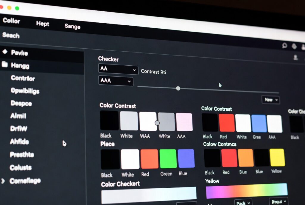
So, what’s a Color Contrast Checker, exactly? It’s a tool that compares how bright or dark two colors are—usually your text and its background. It spits out a number, the contrast ratio, between 1:1 (no contrast at all) and 21:1 (black on white, maximum contrast). Then it tells you if your combo passes or fails according to WCAG 2.1/2.2 standards.
No more guessing if your “muted gray” text is readable on that “elegant beige.” The checker gives you a straight answer, based on the actual rules. The better tools even let you see how your color choices look for people with different types of color blindness, so you can spot problems you might’ve missed otherwise.
If you’re shopping for a professional-grade checker, make sure it can do these things:
- Dual Input: Let you type in HEX/RGB codes or use an eyedropper to grab colors right off your website.
- WCAG Grading: Instantly tell you if you pass AA (basic compliance) or AAA (stricter), for both regular and large/bold text.
- Color Blindness Simulation: Show previews for common vision types like protanopia, deuteranopia, and tritanopia.
- Smart Suggestions: Automatically suggest new colors if your combo fails.
- Text Size Awareness: Know when larger or bolder text has different requirements.
- Compliance Reports: Export proof of your results for clients or accessibility audits.
How do you actually use this thing? Here’s the quick, four-step process:
Step 1: Enter Your Colors
Plug in your text and background colors. Use the eyedropper to pick straight from your live site if you want to be exact. Or just type in HEX codes. Make sure you’re testing the real thing—not just what’s in your design file. Sometimes the final color on screen changes because of lighting, screen type, or even a stray CSS rule.
Step 2: Check the Ratio and Grade
The tool will instantly show you the contrast ratio—say, 4.78:1. It’ll also flag whether you pass or fail for AA or AAA, for both regular and large text. Most tools use color-coded badges (green for pass, red for fail) so you can see right away if you’re good or need to fix something. The ratio is what matters for compliance.
Step 3: Preview Accessibility
Don’t just look at the numbers. Flip through the simulator tabs and see how your color combo looks for people with color blindness, or check the blurred view for users with low vision. Sometimes a pair that technically passes still doesn’t work for everyone. This step helps you catch those cases.
Step 4: Adjust or Approve
If you fail, use the built-in slider to tweak your colors until you pass. Most tools let you drag the foreground or background lighter or darker until you hit the right ratio. Copy the new color code and drop it into your CSS or design file. If you pass, save the result for your accessibility records.
That’s it. Make contrast checking part of your process, not an afterthought. Your site—and your users—will thank you.
Checkout our new tool Coin Toss Simulator here….
FAQs
Is black on white the only perfect combination?
While black (#000000) on white (#FFFFFF) provides the maximum 21:1 ratio, many dark grays on off-whites pass comfortably and are easier on the eyes for extended reading. For example, dark charcoal (#333333) on a light gray (#FAFAFA) yields a strong ~12:1 ratio.
Do I need to check colored text on a colored background?
Absolutely. In fact, these combinations are most prone to failure. A red (#FF0000) on a green (#00FF00) background may look bright, but their luminance is similar, resulting in a terrible contrast ratio of about 2.3:1, which fails spectacularly.
What about logos or incidental text?
The WCAG guidelines make an exception for “incidental” text. Text that is part of an inactive UI component, purely decorative, or part of a logo has no contrast requirement. However, if text in a logo conveys important information (like a company name used as a heading), it should be evaluated.
How do I handle images with overlaid text?
This is complex. The contrast must be sufficient over the most challenging part of the image the text covers. Solutions include adding a semi-transparent scrim (dark overlay) behind the text, ensuring the text only sits over a consistent, dark area of the image, or using a solid text background “chip.”