
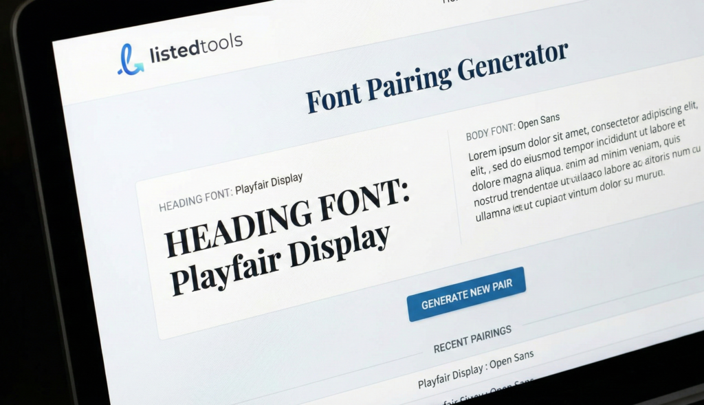
Font Pairing Generator
About this tool: Find the perfect font combinations for your website. This tool helps you discover complementary font pairings for headings and body text to create visually appealing typography.
How to use: Select a font for your headings or browse through our recommended pairings. Preview how the fonts look together with sample text. Copy the generated HTML and CSS code to use in your projects.
Crafting Beautiful Typography
Good typography makes the reading experience more enjoyable. When heading and body fonts are paired thoughtfully, they create visual harmony while maintaining readability. The right combination helps establish hierarchy and improves the overall design.
<!-- HTML -->
<link href="https://fonts.googleapis.com/css2?family=Playfair+Display:wght@700&family=Source+Sans+Pro:wght@400&display=swap" rel="stylesheet">

/* CSS */
h1, h2, h3, h4, h5, h6 {
  font-family: 'Playfair Display', serif;
}

body, p {
  font-family: 'Source Sans Pro', sans-serif;
}
Font Pairing Generator | Find Perfect Typeface Matches
Create beautiful font combinations instantly with our free generator. Perfect for designers, developers, and brands seeking harmonious typography.
Create Stunning Designs with a Font Pairing Generator
Do your font combinations look awkward or unprofessional? Choosing typefaces that work well together is one of the most challenging aspects of design. Poor pairings can make your content difficult to read and undermine your brand’s credibility. A Font Pairing Generator is the ultimate solution for designers, marketers, and website creators. This intelligent tool takes the guesswork out of typography by automatically suggesting harmonious font combinations based on design principles. Discover how to transform your projects with perfectly paired typefaces.
What is Font Pairing and Why Does It Matter?
Font pairing is the art of combining two or more typefaces that complement each other to create visual hierarchy and interest. Effective pairing establishes clear distinctions between headings, subheadings, and body text while maintaining overall harmony.
Great font pairing matters because:
- It improves readability and user experience
- It establishes visual hierarchy and organization
- It reinforces brand personality and professionalism
- It creates emotional impact and visual appeal
5 Essential Font Pairing Principles
Our Font Pairing Generator applies these proven design principles to create perfect combinations:
- Contrast is Key
Pair a strong, decorative font with a simple, neutral one. For example, combine a bold sans-serif headline with a delicate serif body text. - Maintain Similar Proportions
Choose fonts with similar x-height and character width to ensure visual harmony while maintaining enough contrast in weight and style. - Limit Your Selection
Stick to 2-3 typefaces maximum. Too many fonts create visual chaos and distract from your content. - Consider Readability
Always prioritize legibility, especially for body text. Fancy decorative fonts should typically be reserved for headlines and display purposes. - Match the Mood
Ensure your font combinations reflect the appropriate tone – whether professional, playful, elegant, or modern.
Classic Font Pairing Combinations That Work
These time-tested combinations demonstrate effective pairing strategies:
- Roboto + Roboto Slab (Sans-serif + Slab Serif)
Modern and versatile for web design - Playfair Display + Source Sans Pro (Elegant Serif + Clean Sans)
Perfect for luxury brands and editorial design - Montserrat + Merriweather (Geometric Sans + Traditional Serif)
Excellent contrast for digital platforms - Helvetica Neue + Garamond (Classic Sans + Timeless Serif)
Professional and trustworthy for corporate use
How to Use Our Font Pairing Generator
Our tool makes professional typography accessible to everyone:
- Select a Starting Point
Choose a base font you want to work with, or let the generator suggest complete combinations from scratch. - Generate Pairings
Click the generate button to see carefully curated combinations that follow design best practices. - Customize and Refine
Adjust font sizes, weights, and spacing to fine-tune the appearance for your specific needs. - Test with Your Content
Preview the pairings with your actual text to ensure they work in context. - Implement with Confidence
Copy the CSS code or font names to use in your project immediately.
Common Font Pairing Mistakes to Avoid
Even experienced designers sometimes make these errors:
- Too Much Similarity
Using fonts that are too alike creates confusion rather than hierarchy - Clashing Personalities
Mixing a formal serif with a casual handwritten font rarely works - Ignoring Context
Choosing playful fonts for serious content, or vice versa - Poor Readability
Sacrificing legibility for style in body text sections - Inconsistent Sizing
Not establishing clear size relationships between typefaces
Conclusion: Elevate Your Designs with Perfect Typography
Great font pairing can transform your designs from amateur to professional, enhancing both aesthetics and functionality. With our Font Pairing Generator, you can create harmonious, effective typographic combinations in seconds, regardless of your design experience.
Ready to create beautiful, professional designs? Use our free Font Pairing Generator today and discover the perfect typeface combinations for your next project!
- This is the industry standard for automated font pairing using deep learning. Linking here helps users who want an immediate, one-click solution to generate pairings.
Frequently Asked Questions (FAQs)
How many fonts should I use in one design?
Stick to 2-3 fonts maximum. Use one for headings, one for body text, and optionally a third for accents or special elements.
Can I pair two sans-serif fonts together?
Yes, but ensure sufficient contrast in weight, size, or style. Pair a bold condensed sans-serif with a light extended one, for example.
What’s the difference between serif and sans-serif fonts?
Serif fonts have small strokes attached to letters (Times New Roman), while sans-serif fonts lack these strokes (Arial). Serifs often feel traditional, sans-serifs modern.
How do I know if my font pairing is effective?
Test it with real content, check readability at different sizes, and get feedback from others. If it’s easy to read and visually appealing, you’ve succeeded.