
CSS Border Radius Generator
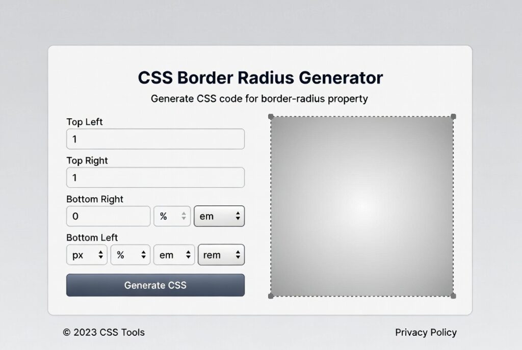
About this tool: Create custom CSS border radius effects with live preview. Adjust each corner independently or use the master slider to control all corners at once.
How to use: Use the sliders to adjust the border radius for each corner. Toggle between pixels and percentages depending on your needs. Copy the generated CSS code to use in your projects.
border-radius: 10px;
Introduction:
What makes a modern website actually feel welcoming? It’s not just the colors or the fonts. Honestly, it’s often the way harsh edges disappear. That little trick—making corners softer—is all about CSS border-radius. This one property flipped web design from stiff, blocky layouts to something that just feels more natural and alive. But let’s be real: if you’ve ever tried to calculate perfect elliptical corners or mix different radii for each edge, the math gets annoying fast. That’s exactly why CSS Border Radius Generators exist. They’re like having a calculator, but built for designers.
Picture this: you want a crisp circular avatar, a pill-shaped button, or a funky card with four different corner styles. The last thing you need is to hand-code every pixel value and keep refreshing your browser. With the right generator, you just drag a few sliders, see the changes instantly, and copy the CSS. For designers and developers, it’s the fastest shortcut from idea to production-ready code. Let’s dig into how these tools can seriously speed up your workflow.
So, what’s a CSS Border Radius Generator, really? It’s a web tool—usually super visual—that lets you tweak the border-radius property using sliders, number fields, and a live preview. Instead of memorizing or typing something like border-radius: 15px 5px 20px 10px; then guessing at the results, you just adjust the corners on-screen. The code updates right away, and you can see exactly what you’re getting.
These tools take the guesswork out of complex border-radius syntax. Want to make a button with perfectly smooth corners? Or create an odd, organic shape you couldn’t hand-code in ten tries? The generator handles all of it, visually, with no need to crack open a CSS reference.
Here’s what a solid generator lets you control:
- Individual Corners: You can set each corner—top-left, top-right, bottom-right, and bottom-left—independently.
- Elliptical Corners: Use the / syntax to set separate horizontal and vertical radii for wilder, less uniform shapes.
- Percentages: Want corners that scale with your element? Switch from pixels to percentages, and the rounding stays consistent no matter the size.
- Live Preview: Usually a box or button that changes as you move the sliders.
- Copy Button: Instantly grab the code with one click.
How do you actually use one? It’s straightforward:
- Pick your element shape. You’ll usually start with a basic rectangle. Think about what you’re designing: a card, a button, maybe a profile image. If you want a circle, you’ll need all corners set the same.
- Adjust the corners. Move the sliders or type values for each corner. For a uniform look, use the “All Corners” control. Even a few pixels rounds things out; crank it up for that pill effect. The live preview means you’re never guessing.
- Try advanced options. Flip on “Elliptical” or “Advanced” mode to really play—set separate horizontal and vertical radii for each corner. This is where things get creative. For example, border-radius: 50px/20px; gives you a squished oval instead of a perfect circle.
- Copy and use your code. Once it looks right, just copy the CSS property (something like border-radius: 15px 5px 20px 10px; or border-radius: 40px 20px 60px 30px / 20px 10px 30px 15px;) and drop it into your stylesheet.
Where does border-radius really shine in design?
- Buttons and Forms: Go for 4-8px for a soft, friendly feel. Want those big, pill-shaped CTAs? Think 50px or higher.
- Cards and Containers: Rounding just the top corners (say, 12px 12px 0 0) gives a nice, subtle lift to sections without making everything look like a bubble.
- Circular Avatars: Set border-radius to 50% and any square image turns into a perfect circle—ideal for profile pics.
- Unique, Organic Shapes: Mix and match the corners for something memorable, like border-radius: 30px 5px 30px 5px; for an uneven but cool content block.
A quick word on performance and accessibility: Modern browsers handle rounded corners fast, thanks to GPU acceleration. You won’t see much slowdown unless you stack border-radius with heavy box-shadows on tons of elements. And don’t forget accessibility. Make sure your rounded buttons and inputs are still easy to see and use. The look should never get in the way of someone actually clicking or reading.
Bottom line: with a CSS Border Radius Generator, you design faster, experiment more, and never have to fuss with tricky math or syntax. It’s a simple tool, but it makes your web design feel fresh, modern, and—most importantly—human.
Checkout our new tool Countdown Timer Generator here….
FAQs
What’s the difference between px and % values in border-radius?
Pixel values are absolute – 10px is always 10 pixels. Percentage values are relative to the element’s dimensions. 50% on a square element creates a perfect circle, while 50% on a rectangle creates an elliptical shape. Percentages are excellent for responsive design.
Can I animate border-radius properties?
Yes! Border-radius is fully animatable with CSS transitions and animations. You can smoothly transition from square to circle, or between different corner values. Example: transition: border-radius 0.3s ease
How many values can border-radius accept?
The shorthand accepts one to four values (like padding/margin): One value applies to all corners. Two values set top-left/bottom-right and top-right/bottom-left. Three values set top-left, top-right/bottom-left, and bottom-right. Four values set each corner individually (TL, TR, BR, BL).
Does border-radius work with all HTML elements?
It works with most elements that have a box model – divs, buttons, images, inputs, etc. Some older browsers may not support it on table elements, but modern browsers handle it well across elements.