
Screen Resolution Detector
This tool detects and displays your current screen resolution, device pixel ratio, and other display information. It helps web developers, designers, and anyone who needs to know their screen specifications.
How to use: Simply view this page and your screen resolution information will be displayed automatically. Click “Refresh Info” if you change your display settings or rotate your device.
Screen Resolution Detector | Check Your Display
Detect your screen resolution, color depth, and browser viewport instantly. Our free tool helps web developers and designers optimize for different displays.
Introduction
Creating a website or application that looks great on all devices? Need to know your audience’s screen sizes for better design decisions? Understanding screen specifications is crucial for delivering optimal user experiences. A screen resolution provides instant insights into your display capabilities and helps developers create responsive designs. This guide will explain why screen metrics matter and how our free tool helps you optimize for every device.
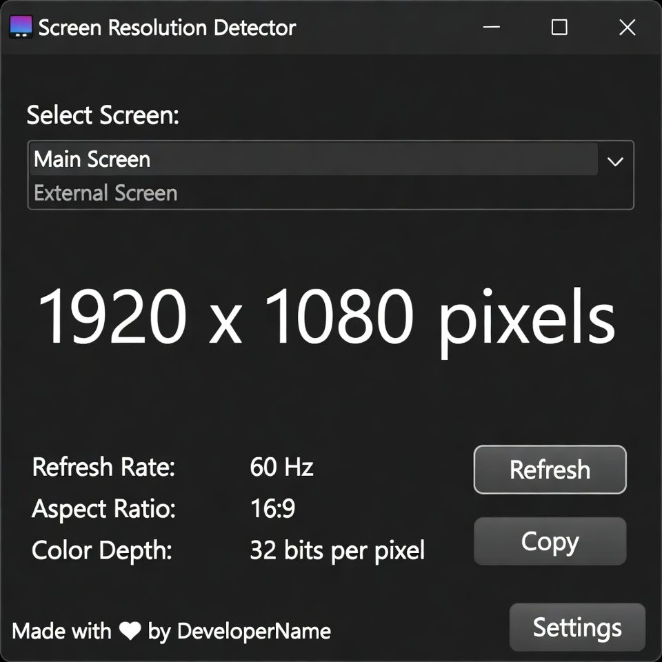
What is a Screen Resolution Detector?
A resolution detector is a web tool that analyzes and displays your current screen specifications. It detects key display metrics that affect how content appears on different devices.
Our comprehensive detector measures:
- Screen resolution (width × height in pixels)
- Color depth and capabilities
- Browser viewport dimensions
- Pixel ratio for high-density displays
- Available screen space excluding browser UI
Why Screen Resolution Knowledge Matters
Understanding display specifications impacts user experience, design quality, and technical performance.
1. Responsive Web Design
Create layouts that adapt perfectly to different screen sizes and orientations.
2. Cross-Device Compatibility
Ensure your website or application works flawlessly across desktops, tablets, and mobile devices.
3. Performance Optimization
Serve appropriately sized images and assets based on users’ screen capabilities.
4. User Experience Improvement
Design interfaces that utilize available screen space efficiently and intuitively.
Key Features of Our Screen Detector
Our tool provides detailed display analysis with these user-friendly features.
- Instant Detection: Get your screen metrics immediately upon visiting
- Multiple Metrics: Resolution, viewport, color depth, and pixel ratio
- Real-Time Updates: Monitor changes when resizing browser windows
- Copy Functionality: Easy sharing of technical specifications
- No Installation: Works directly in your web browser
Common Detection Scenarios
Here are practical situations where screen resolution detection provides immediate value.
Web Development
- Test responsive breakpoints during development
- Verify design renders correctly on target resolutions
- Optimize layouts for most common screen sizes
Quality Assurance
- Check application appearance across different devices
- Identify resolution-specific layout issues
- Ensure consistent user experience
Design Planning
- Research target audience display capabilities
- Plan design systems for multiple screen sizes
- Create assets optimized for common resolutions
How to Detect Screen Resolution
Getting your display specifications takes just one simple step.
- Visit Our Tool: The detector automatically scans and displays your screen metrics
- Review Results: Analyze your resolution, viewport, and other specifications
- Use Data: Apply insights to your development or design projects
Understanding Screen Metrics
Different display measurements serve different purposes in web development.
Screen Resolution
Total physical pixels available on your display device.
Viewport Size
Visible browser window area excluding scrollbars and navigation elements.
Pixel Ratio
Relationship between physical pixels and CSS pixels on high-density displays.
Color Depth
Number of bits used to represent color information on your display.
Screen Resolution Best Practices
Follow these guidelines for optimal cross-device design and development.
Design for Multiple Breakpoints
Create fluid layouts that work across common resolution ranges rather than specific sizes.
Test on Real Devices
Use detection tools alongside actual device testing for comprehensive quality assurance.
Consider Aspect Ratios
Account for different screen proportions beyond just pixel dimensions.
Plan for Future Resolutions
Design scalable systems that accommodate evolving display technologies.
Conclusion
Screen resolution detection is fundamental to creating websites and applications that provide optimal viewing experiences across all devices. A reliable resolution detector gives developers and designers the precise metrics needed to build responsive, user-friendly interfaces. Whether you’re testing breakpoints, optimizing images, or planning design systems, understanding display specifications ensures your digital products look and function perfectly for every user.
Checkout Our new tool Robots.txt Generator here….
Ready to optimize for all screens? [Use our free Screen Resolution now] and get detailed display metrics instantly!
Frequently Asked Questions (FAQs)
Is this screen resolution detector completely free?
Yes, 100% free with no usage limits, registration requirements, or hidden costs.
What’s the difference between screen resolution and viewport?
Screen resolution is your display’s total pixels, while viewport is the visible browser area.
Can I use this tool on mobile devices?
Absolutely. The detector works on smartphones, tablets, laptops, and desktop computers.
Why does pixel ratio matter?
Pixel ratio affects how sharp images appear on high-density (Retina) displays.
Is this screen detector completely free?
Yes, 100% free with no usage limits, registration requirements, or hidden costs.
What’s the difference between screen resolution and viewport?
Screen resolution is your display’s total pixels, while viewport is the visible browser area.
Can I use this tool on mobile devices?
Absolutely. The detector works on smartphones, tablets, laptops, and desktop computers.
Why does pixel ratio matter?
Pixel ratio affects how sharp images appear on high-density (Retina) displays.